Strip the colour out and let the linework carry everything. Black and white anime art in this style leans on the tools print manga was built with — solid black masses for hair and shadow, screentone dots for midtones, and speed lines or halftone bursts when a panel needs energy. Contrast runs high, whites stay genuinely white, and the ink varies in weight so contours feel drawn rather than traced. It suits doujin covers, chapter art, and any character that looks better without a palette. Free on KusArt, no login required.
Black and white anime art created by the KusArt community. Click any image to see its details and try the same prompt.
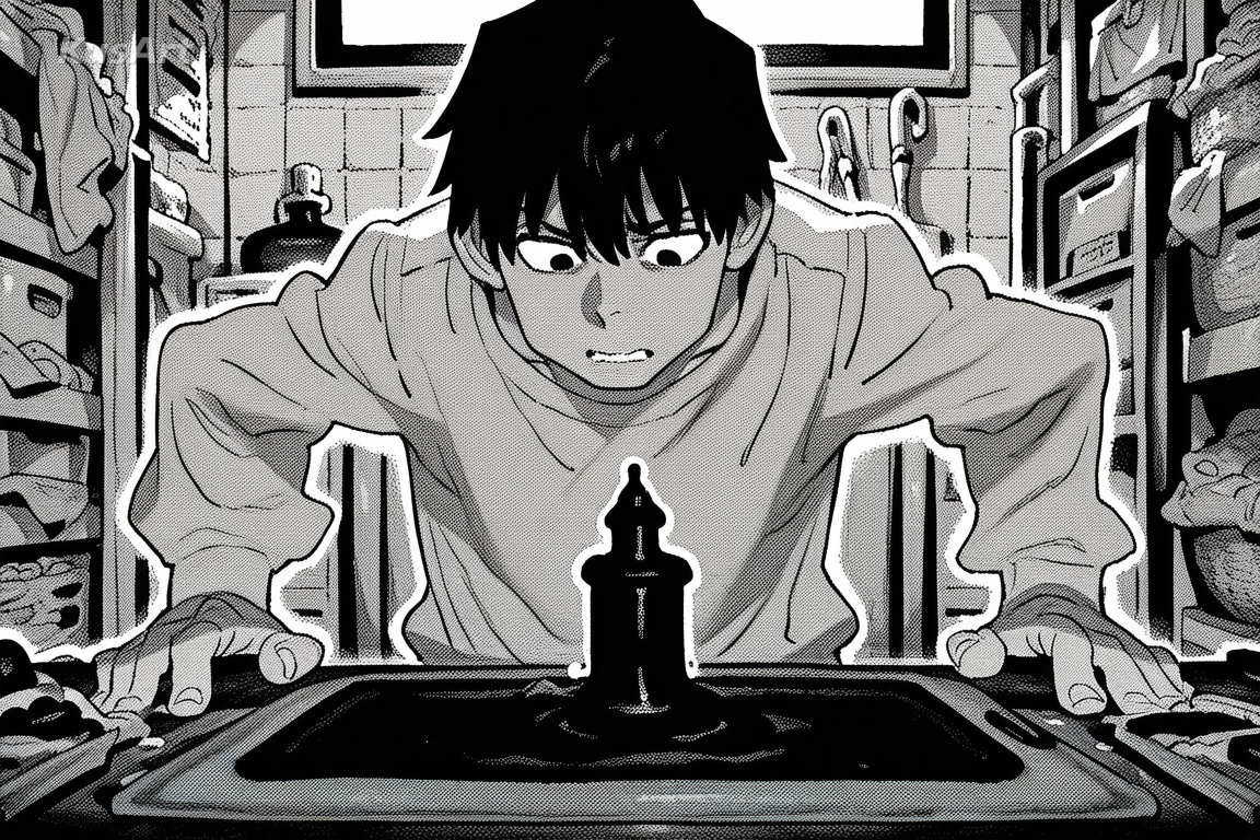
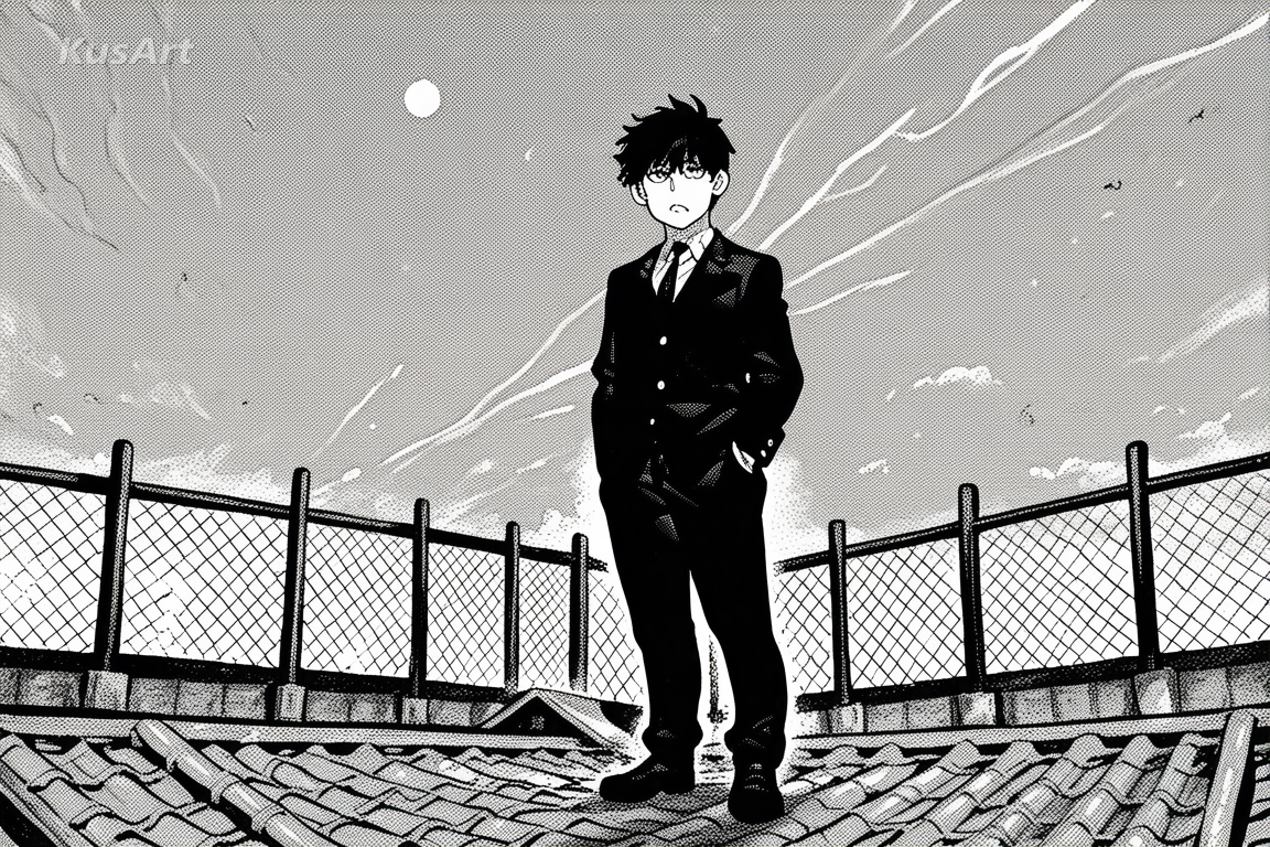
Modern Ink treats the absence of colour as an advantage rather than a limitation. Without hue to separate elements, the entire burden falls on value and texture, and the style handles it the way printed manga does. Large areas commit to solid black — hair, coats, cast shadows — creating anchors that give a composition immediate structure. Midtones arrive as screentone: regular dot patterns at varying densities, sometimes layered or cut with a blade edge for a gradient, never as soft grey wash. That distinction matters, because dots read as print while grey wash reads as pencil, and this style is firmly on the print side. Linework varies in weight deliberately, thickening where forms overlap and at the underside of a jaw or sleeve, which is what gives the drawing its confident, hand-inked feel. Faces keep clean whites in the eyes with a single black pupil and a sharp catchlight, so expression survives even in heavy shadow. When a scene needs motion, the style reaches for speed lines and halftone bursts rather than blur. The result is character art that would print cleanly on newsprint, which is exactly the standard it was built to.
These are the print-derived choices that give the style its confident black and white feel.
Hair, coats, and cast shadows commit fully to black rather than settling for dark grey. These anchors give the composition structure and make the whites feel genuinely bright by comparison.
Try Black Masses →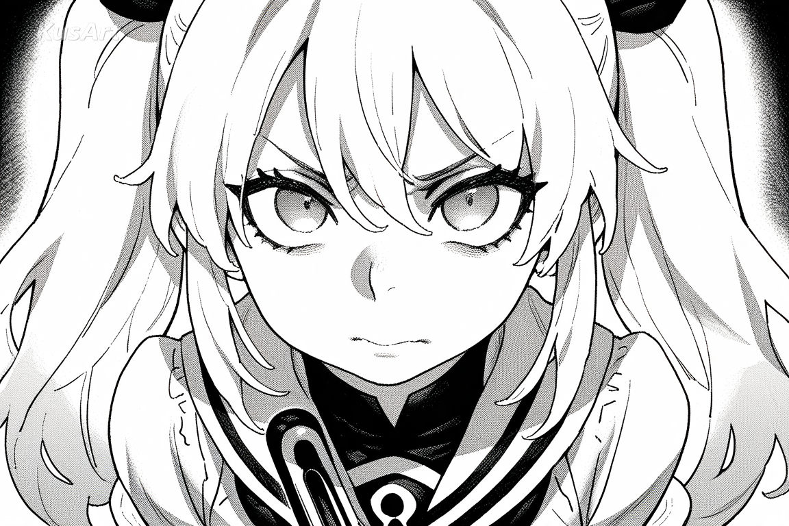
Midtones arrive as regular dot patterns at varying densities, layered or bladed for gradients. Dots read as print, which keeps the style firmly in manga territory rather than pencil sketch.
Try Screentone →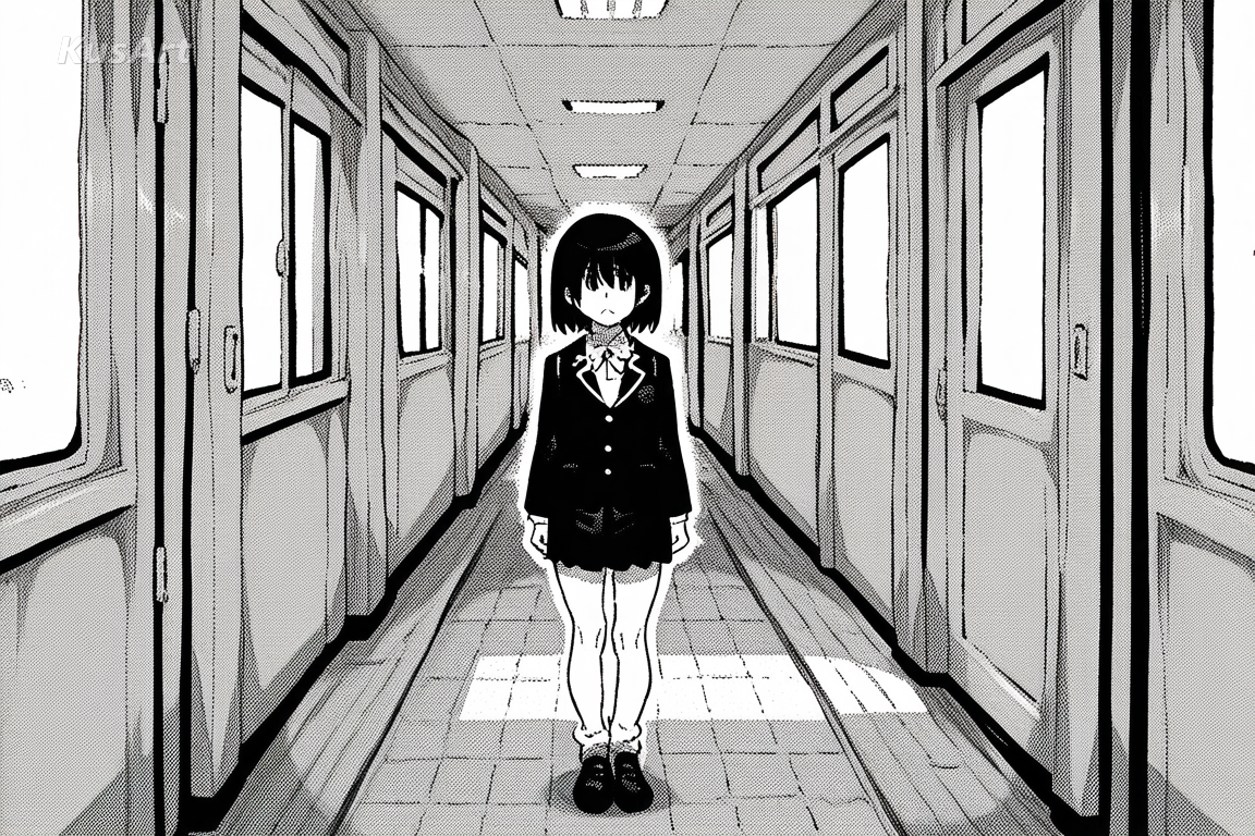
Lines thicken where forms overlap and under a jaw or sleeve, thinning across open surfaces. That variation is what separates confident hand inking from uniform digital tracing.
Try Ink Weight →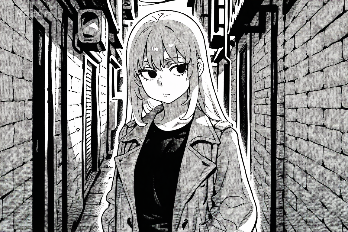
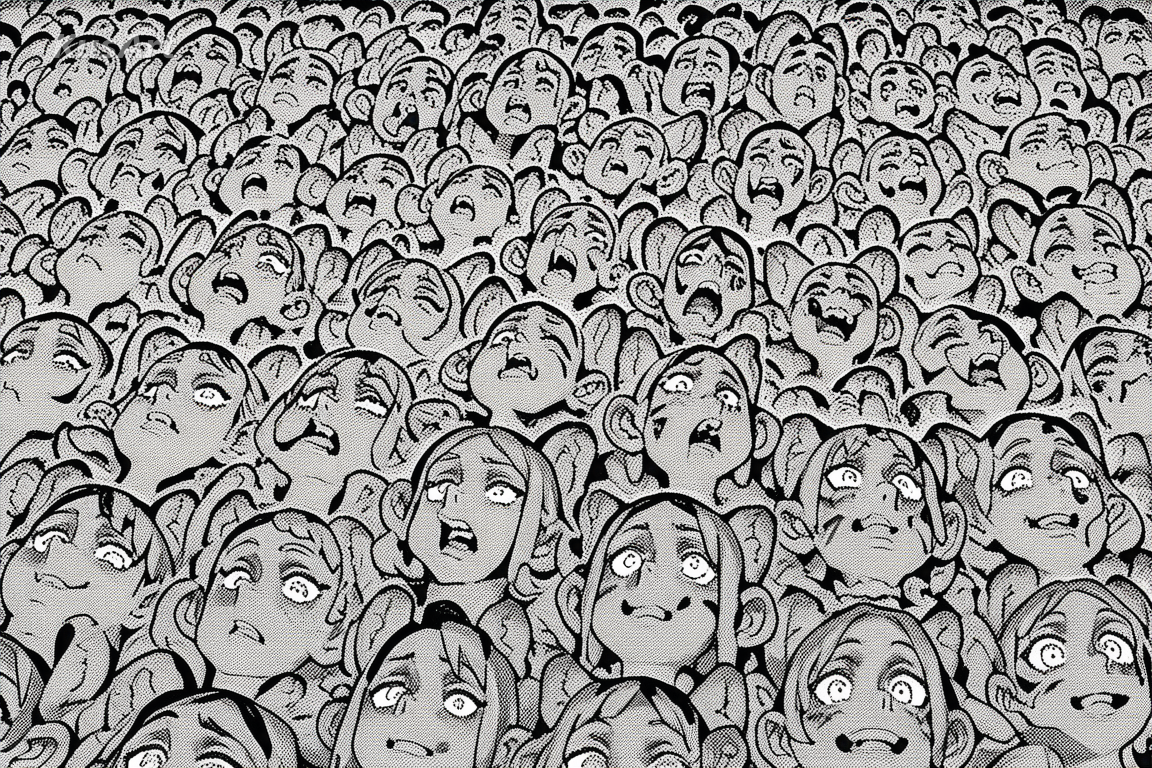
Motion is drawn, not blurred. Radiating speed lines and halftone burst backgrounds deliver energy the way a printed action panel does.
Try Motion Effects →Reach for this style whenever print logic serves the image better than colour would.
Solid blacks and screentone reproduce perfectly in print, making this a natural fit for covers and chapter openers that need to survive a photocopier.
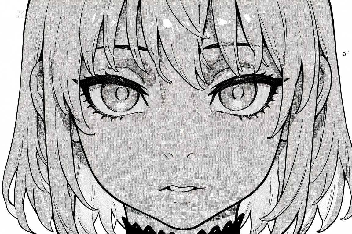
Without colour to lean on, portraits rely on value and contour. The result feels more graphic and more serious than the same character rendered in full colour.
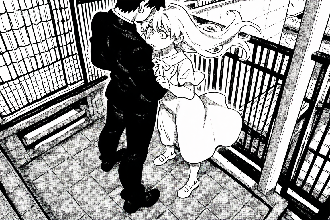
Speed lines and halftone bursts give fights and chases the read they need. It is the visual grammar action manga has used for decades.
Open the KusArt Image Generator and select 'Modern Ink' from the style panel.
Describe your character and, importantly, the mood — contrast level is doing the work colour usually does.
Add 'screentone' or 'speed lines' if you want those print effects to appear explicitly.
Generate, then refine with Image-to-Image if you want heavier blacks or a cleaner white background.
It is a black and white anime style built on print manga technique — solid black masses, screentone dot midtones, varied ink weight, and drawn motion effects rather than blur.
Monochrome Manga leans toward fine pencil-like line and softer grey values. Modern Ink runs higher contrast, commits large areas to solid black, and uses screentone dots as its primary midtone.
Yes. KusArt offers free AI generation with no login required, so you can create as much black and white art as you like.
That is what the style is designed for. Solid blacks and dot screentone reproduce cleanly in print, unlike soft grey gradients which can band or muddy.
You can take a result into Image-to-Image and ask for a coloured treatment, though the ink discipline is what gives this style its character.
Mood and contrast words matter most. 'Heavy shadow, tense expression, screentone background' will shape the result more than listing clothing details.
Use Modern Ink when you want high-contrast black and white anime art built on confident inking and screentone shading. It is especially useful for doujin and chapter covers, character portraits with weight, and action panels and motion studies.
Start with Image Generator for the fastest prompt-first workflow. If your goal is a profile picture or avatar, Anime PFP Maker is usually the better fit. If you want to build a more structured original character workflow, move into OC Generator.
Reach for this style whenever print logic serves the image better than colour would. After your first strong result, you can carry the same look into OC Generator, Image to Video, and Sticker Generator.
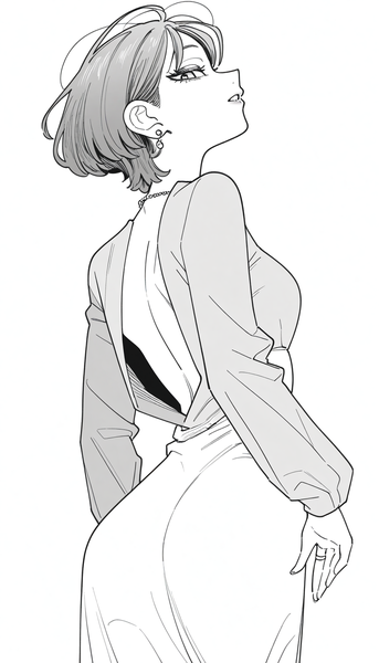
Classic black-and-white manga illustration style with screentone shading, dramatic inking, and the authentic look of printed manga pages.
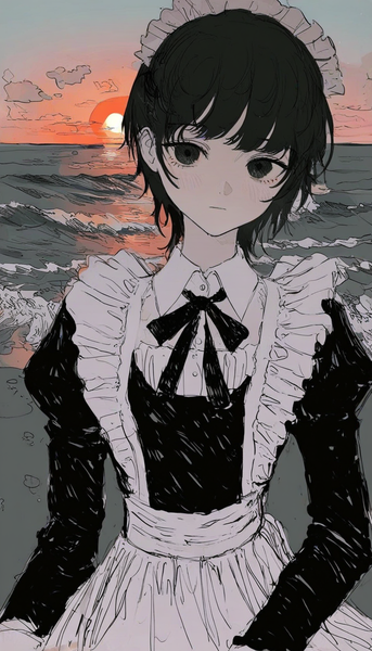
Rough, hand-drawn linework and moody atmospheric coloring for a raw, film noir-inspired character art style.
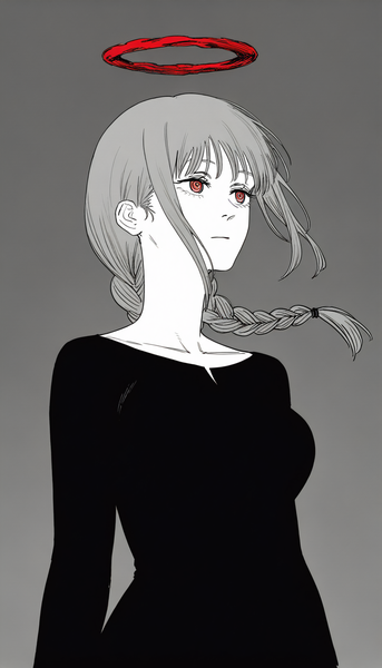
A raw, gritty manga style inspired by Chainsaw Man's distinctive visual approach with rough linework, chaotic energy, and visceral intensity.
Generate print-ready inked character art in seconds — free, no login required.
Includes 100 free credits daily